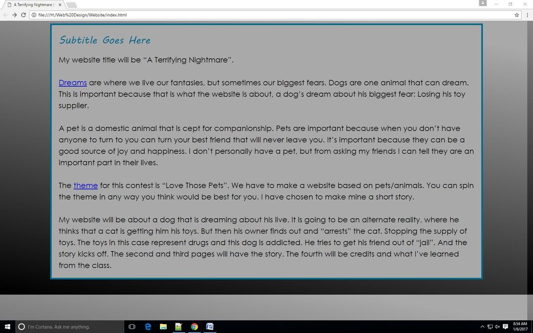
|
I think I did really well for my first page of my first website. I hit almost all the requirements, except the serif font for my content. I think the website looks great, the colors are just a little boring though. I didn't have a favorite part because it was all fun. The readability on some of the links was sub-par and I will change the color scheme a tiny bit. 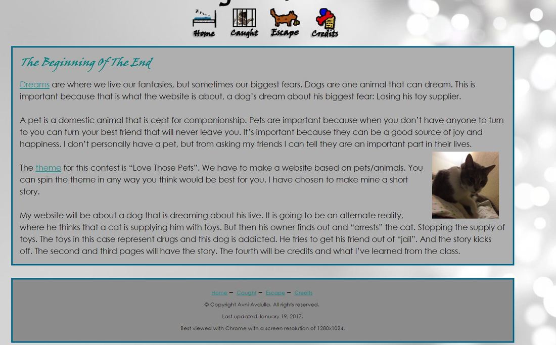 The main color for my logo is brown and some of its many shades. This color doesn't represent anything in particular. It is just the color of the dog I chose. The hex code for it is "#8b4513". My original tagline is going to be "Just a dream". The website is going to be about a fictional story, that is lived in the brain of a sleeping dog. The navigation icons share bits of what is going to happen in the story. The cat being in jail and then an escape from somewhere. It reveals the themes of the story but not too much. In my opinion the rendering process was easy. That is mostly attributed to the great teaching from Mrs. Candela. She really walked us through all the tools, and helped me when I needed it. The one thing I hated about it though, was putting the text in. It is super annoying to drop the text and start typing. For every text you see on screen I had to put the text box in about 3 times. I definitely feel that I knocked Candela's socks off. I rate my work a 5 out of 5. 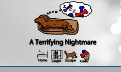 In my opinion, the most important thing in having your website readable is using highlights, lists, and images. I think making it easier for readers to get all the information they need in a quick glance is more beneficial then having them read through a whole paragraph. As the article said, most people don’t read website word for word. So small highlights would give info, and if there is interest based on the highlighted word/phrase. Then maybe they read the whole website. I don’t know what I struggle with the most right now because we haven’t done much yet. But I suspect I will learn very soon.
⚊ |
AuthorAvni Avdulla Archives
March 2017
Categories |
 RSS Feed
