|
Which GOOGLE FONT do you feel could capture the feel of your site? Why? I think a font that would capture my website would be Yanone Kaffeesatz. It is a nice readable font, that's not too fuzzy or harsh. It captures the tone and feel of what I was going for in the story. What is the difference between a system font and a web font? Why would you rather use a web font? System fonts are what you have on the computer you are viewing the website. Not everyone has the same fonts on their computer, so web fonts are better because they are fonts you take from the internet. You don't have to have them downloaded on your computer, they just work when you are offline. That gives no chance that you might not have the font. Which type of font should you use within your body text? Explain. Where could you use the other type of font? For body text you should use sans-serif fonts. It, in most cases, is easier to read. You always want to be your website to be readable. You could use serif fonts in subtitles or headings. It is not good practice to use them in the body text. 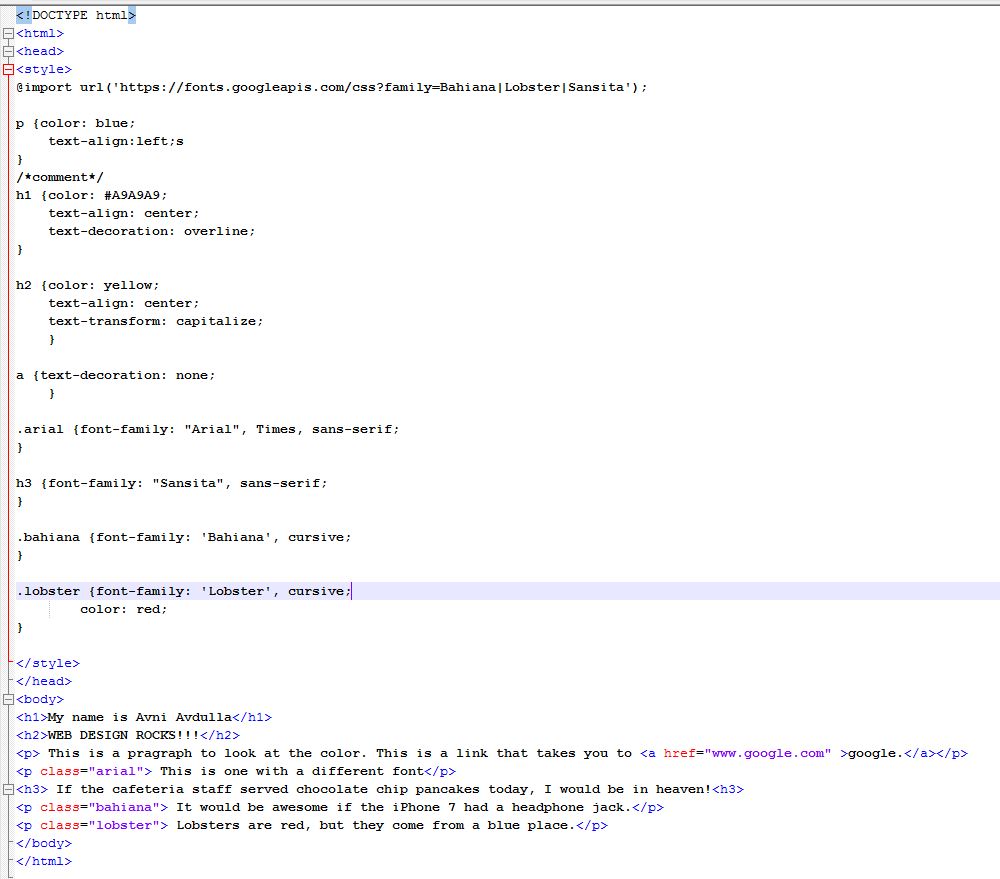 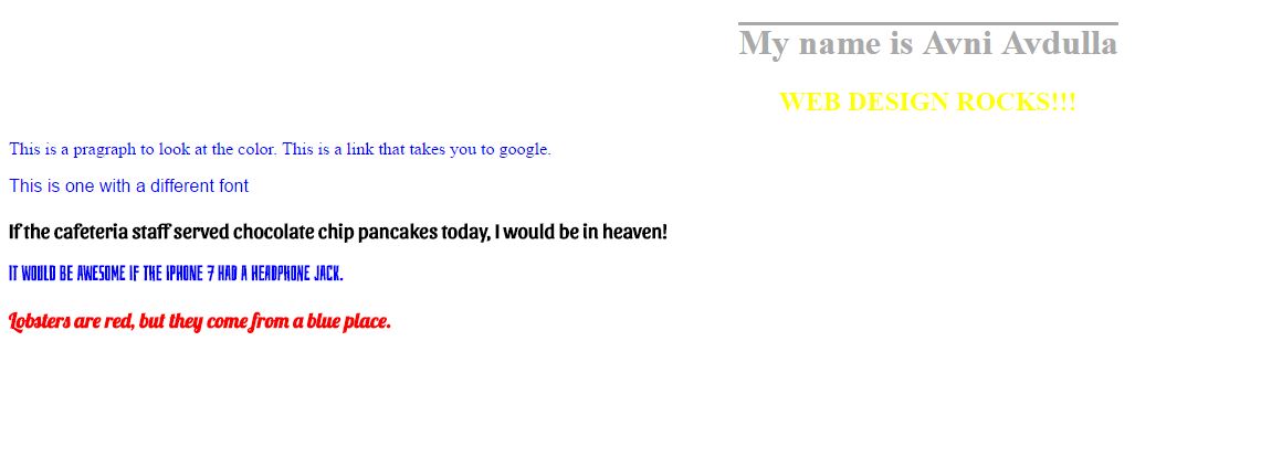
0 Comments
Leave a Reply. |
AuthorAvni Avdulla Archives
March 2017
Categories |
 RSS Feed
