|
These two footers, are very good. They have a lot of relevant information, and also look good. I think having social media links in the footer (in the form of icons) is really cool. I want to do that with our social media, and make my own icons. I want to modify them a little so they conform to the restaurant theme. I also want my footer to go throughout the whole bottom. I think making it a texture (like wood) would also make look cool, like a table-top at a restaurant. 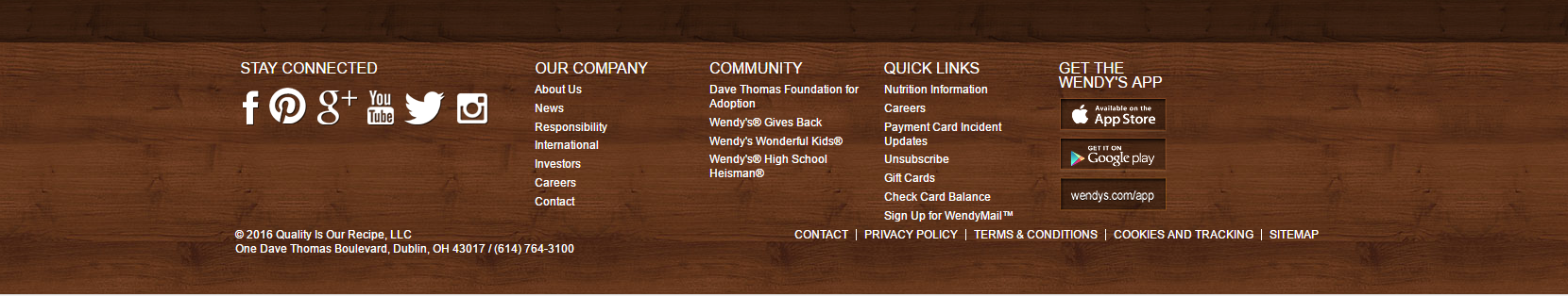 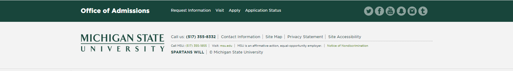
0 Comments
My favorite Error 404 page that I found. There are some really cool ones but this one is simple and I like it. It tells you what the problem is without being to flashy. I want to make one like this, have it be simple but informative. It's going to say "GO BACK! " in big capital letters. Then below that it will say "Error 404, this page doesn't exist. Try going back to the start. (link to website)." I think it will look sleek and clean. 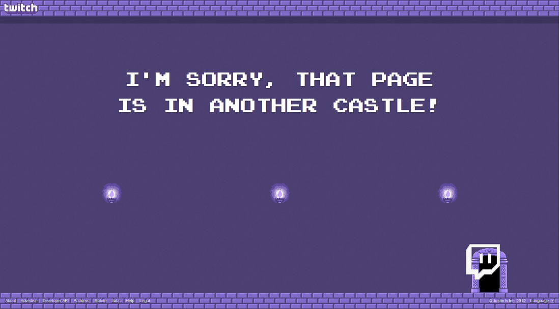 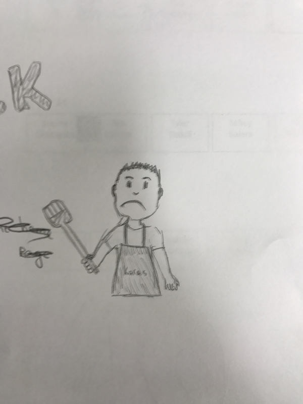 https://bubbl.us/MzgwNTU0NS83ODY4NDcxLzhjOTk5MGU2ODIwMThkNjk4ZDllZGU3YTQ2ODA3ZjZh-X?s=7868471 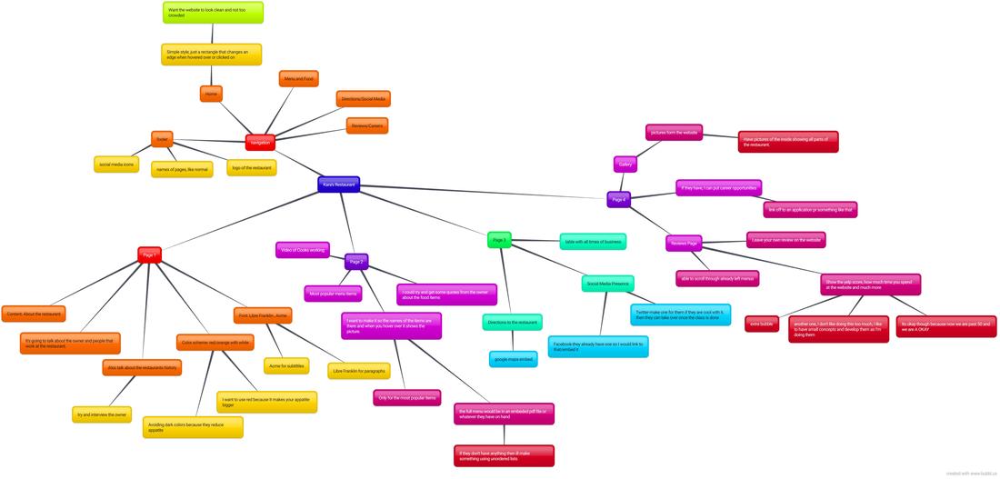
After reading that article I see that resumes are a lot about skimming rather than looking at the details. You don't want to put to much info that it overwhelms the reader. You can have lots of info in your resume, and it doesn't have to be restricted to one page. The information can be there, just not super condensed. The most important information needs to be on the first page. Employers look for resumes that are different than others. One major thing you can do to be different than others is to not have any spelling errors. Employers will sometimes chose a less qualified person instead of a very qualified one due to their resume. I learned that I need to triple check my spelling and grammar on my resume, to give myself the best chance of getting an interview. (I tried typing the "e" with the thing on top but 'alt 0232' didn't work. )
The Resume is here just give it time to load. :) My submission for the logo is also down there.
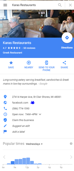 Kara's Restaurant is the business that I want to make a website for. They are extremely well rated on yelp and other review sites, but they don't have a website. Their "website" tab on google maps leads to their Facebook, if somehow they do have a website I cannot find it. I was thinking to make their website have something about the owners, a page dedicated to the menu, one maybe to careers at Kara's, and the last one for finding directions. I think it would be great to make it so in the menu, when you hover over the name of the food it shows a picture of it.
For me the best tip Candela gave in her blog was tip number 2. Be specific. I kept this one in mind the whole time I was writing. I didn't assume that the reader knew what I was talking about. I think giving so many details helps the reader understand the mindset of what I was doing with my website. Details are really important, especially if someone has already seen the website. Giving background on what I did shines some light on why I made some of the decisions I did.
https://docs.google.com/document/d/1kVPfUZXp_t9GsUKCkG6ojXcVopbvS_6skS3RYRUBFaE/edit?usp=sharing
Using a pixel font size is most closely related to using a font size in which Microsoft program? Pixel font size is most closely related to the font number you pick in Microsoft Word. Why are ems considered best practice? Ems are best practice because it is really hard to read text on internet explorer. This is best practice because not everyone uses the best browser, so making sure that everyone can read the website, even internet explorer users. What are the four link states? How will you remember them (and their order)? The four link states are a normal link, a visited link, there is a hover over a link, and there is an active link. I will remember these because they kind of go in order. First you have a normal link, then to go to a visited link, you have to hover and activate it. I guess that isn't the order, but I am just thinking of how you would click a link on a website. 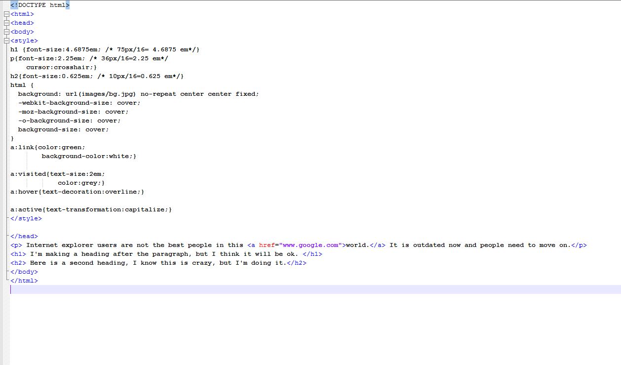 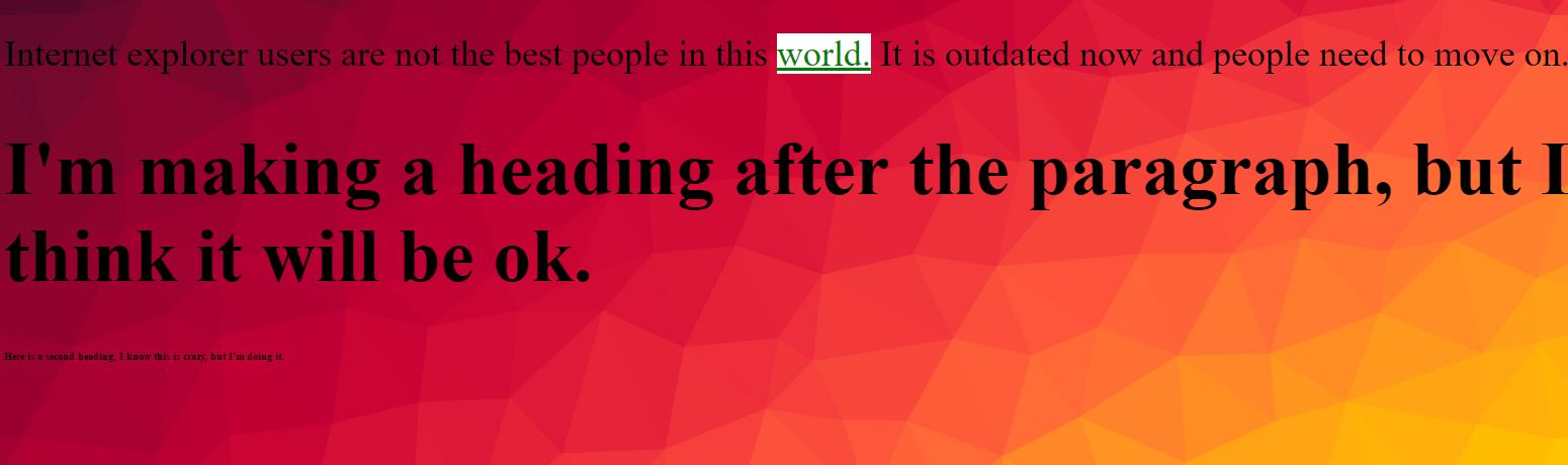 Which GOOGLE FONT do you feel could capture the feel of your site? Why? I think a font that would capture my website would be Yanone Kaffeesatz. It is a nice readable font, that's not too fuzzy or harsh. It captures the tone and feel of what I was going for in the story. What is the difference between a system font and a web font? Why would you rather use a web font? System fonts are what you have on the computer you are viewing the website. Not everyone has the same fonts on their computer, so web fonts are better because they are fonts you take from the internet. You don't have to have them downloaded on your computer, they just work when you are offline. That gives no chance that you might not have the font. Which type of font should you use within your body text? Explain. Where could you use the other type of font? For body text you should use sans-serif fonts. It, in most cases, is easier to read. You always want to be your website to be readable. You could use serif fonts in subtitles or headings. It is not good practice to use them in the body text. 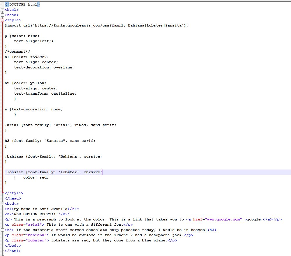 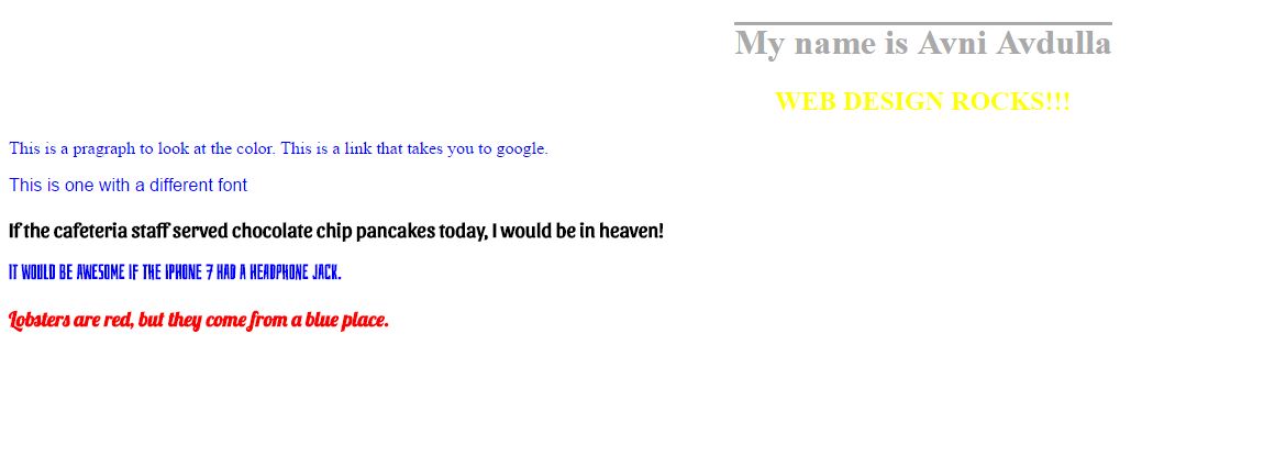 What is CSS? How is it different from HTML? -CSS is kind of an extension to Html. It acts as a styling tool for a website. HTML was built to get the backbone of the website in. You make it look good with CSS. What are the three ways to insert CSS? Which one will we be using the most in class? -3 ways to insert CSS is External, Internal, or Inline. In the real world, professional web designers use external. It is the best one to use. The one we will be using in class is an Internal Style sheet. 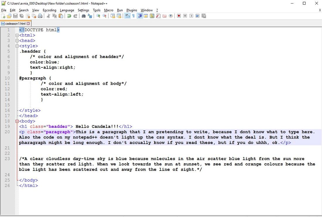 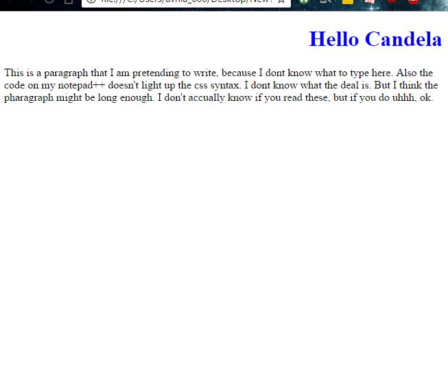 |
AuthorAvni Avdulla Archives
March 2017
Categories |
 RSS Feed
